Huey - Color Generator
Summary
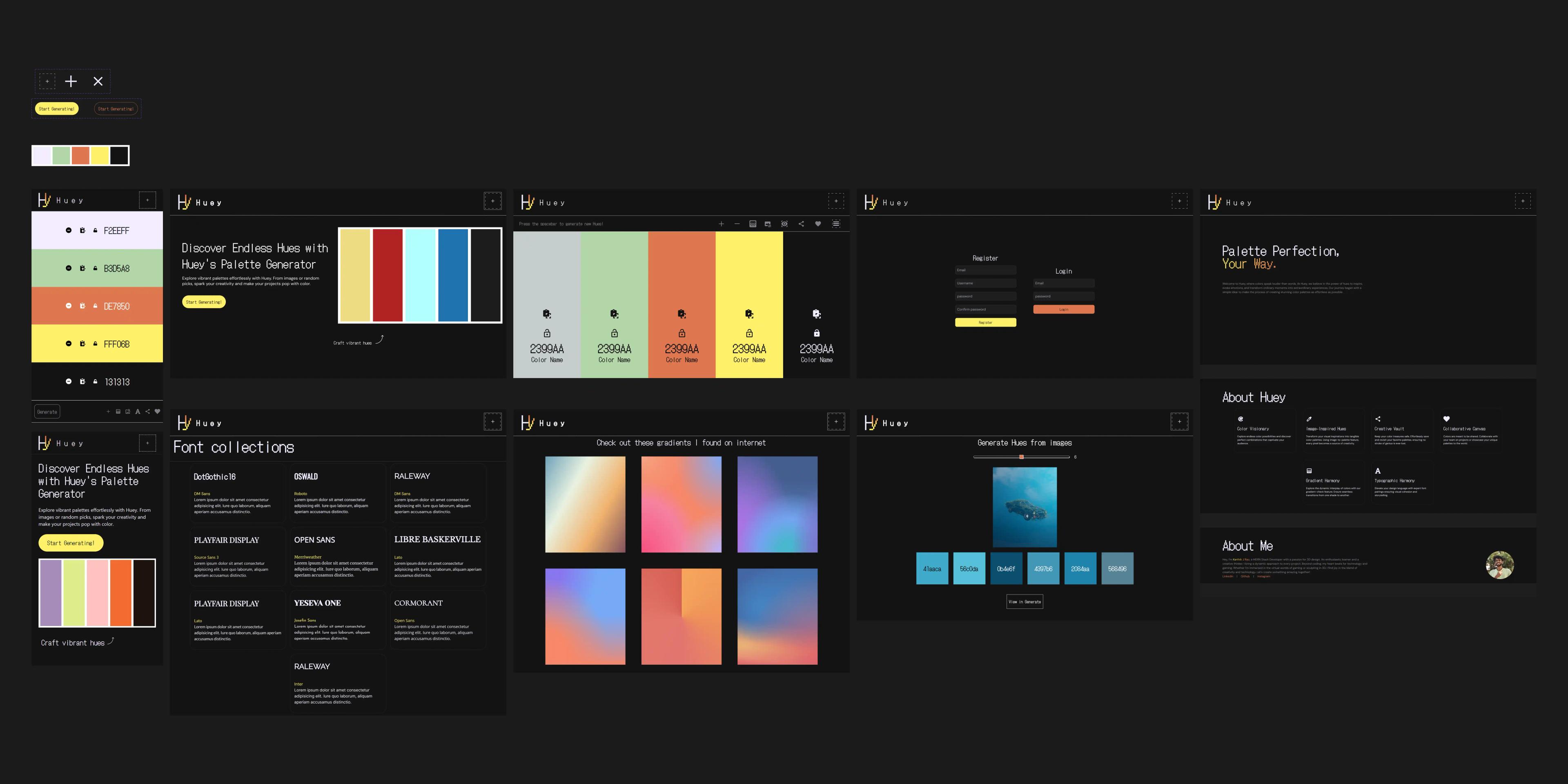
When I found Coolors, a website that makes colors, I really liked how it works and why it looks so good. With that in mind, and already having a liking for the trend of pixel art minimal designs, I thought a website like that would be a perfect fit so I started designing it first.
Genre
Design
Type
Individual Project
Role
UI/UX Designer
Colors
Typography
Primary
DotGothic16
Secondary
DM Sans
Home Page
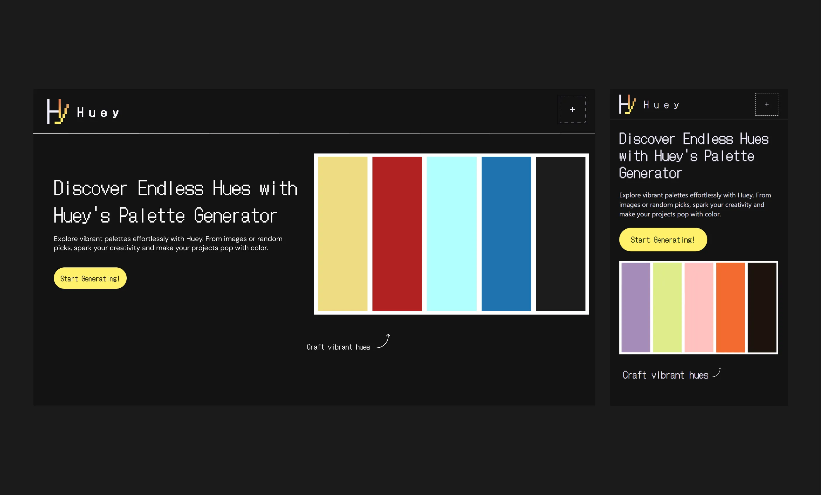
When I looked into designing a homepage, Coolors really stood out to me. They did a fantastic job with their layout. Right away, you see a video of a color generator that keeps changing, which is really cool and inviting. Then, there's an "explore" section filled with all sorts of color combinations created by other users - it gives you a great idea of what's possible. Even a small detail like the handwritten text with an arrow made a big difference. It adds a touch of personality and helps guide your eye. Their homepage had a lot going on, especially the main section. I liked that part, but I decided to keep things a bit simpler for mine. Coolors' design definitely inspired me to create what you see now.
Color Generation
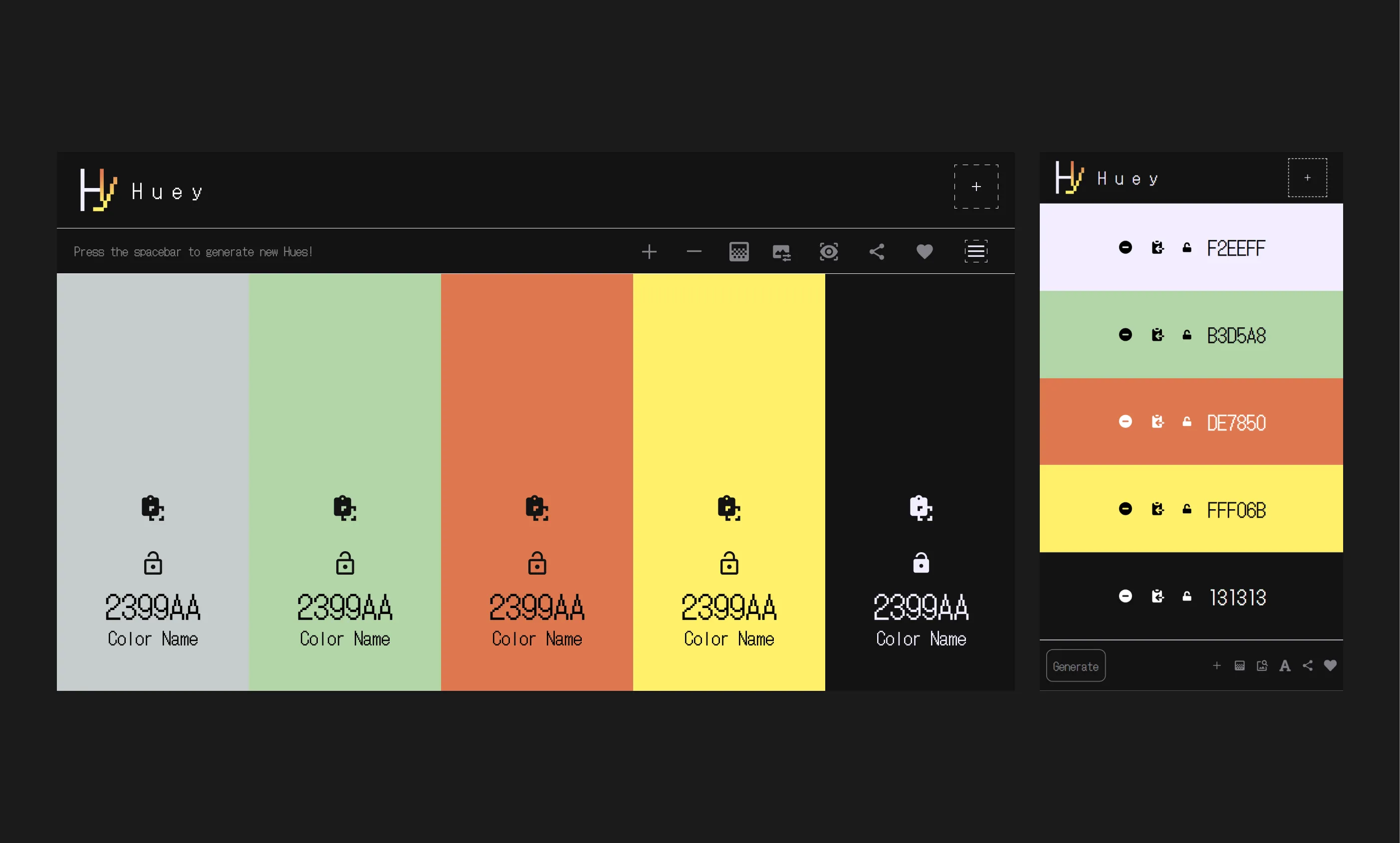
When designing the color generator itself, a crucial element of the website, I noticed a common theme across other color generation tools. They typically used colored blocks with options appearing on hover. Coolors, however, offered a unique approach. They had a central toolbar with some functionalities, while additional options were placed directly on the color blocks themselves. This design resonated with me, so I implemented a similar layout for my color generator. Specific color-related options are placed directly on the color blocks for easy access, while general functionalities are housed within a toolbar at the top of the page.
Gradient Collection
You ever find something awesome online, like amazing gradients, and then totally forget where you saw them later? That happened to me! I was looking for cool gradients for my homepage, and some of them were just incredible. I didn't want to lose track of them, so I decided to create a special page to save them all. I even thought about showing them on cards to see how they'd look as backgrounds.
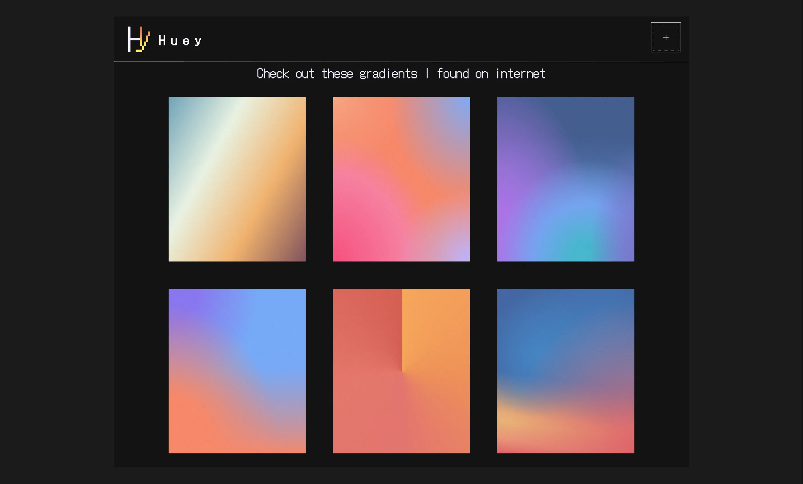
Image-Based Color Generation
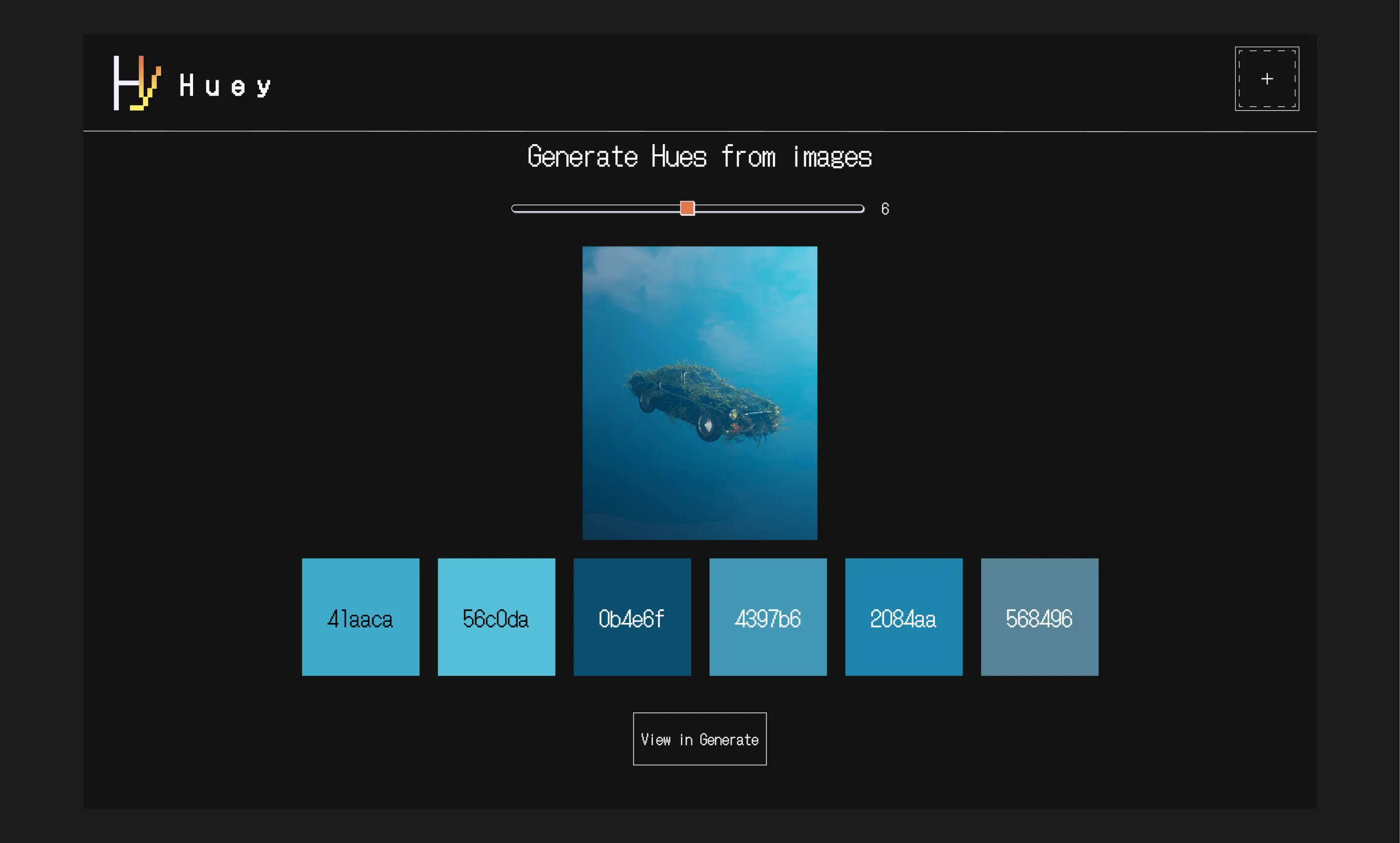
I was almost finished building a website similar to Coolors when I saw a video about creating a Next.js app that could pull colors directly from an image. That totally changed the game! I realized this feature would be amazing for my color generation app. But then came the challenge: how to design it? I wanted the app to be able to generate either one or ten colors at a time, and I also needed a way to show both the generated colors and the image they came from. So, I focused on creating a simple design that looked good and fit the overall feel of the app.
Font Pairings
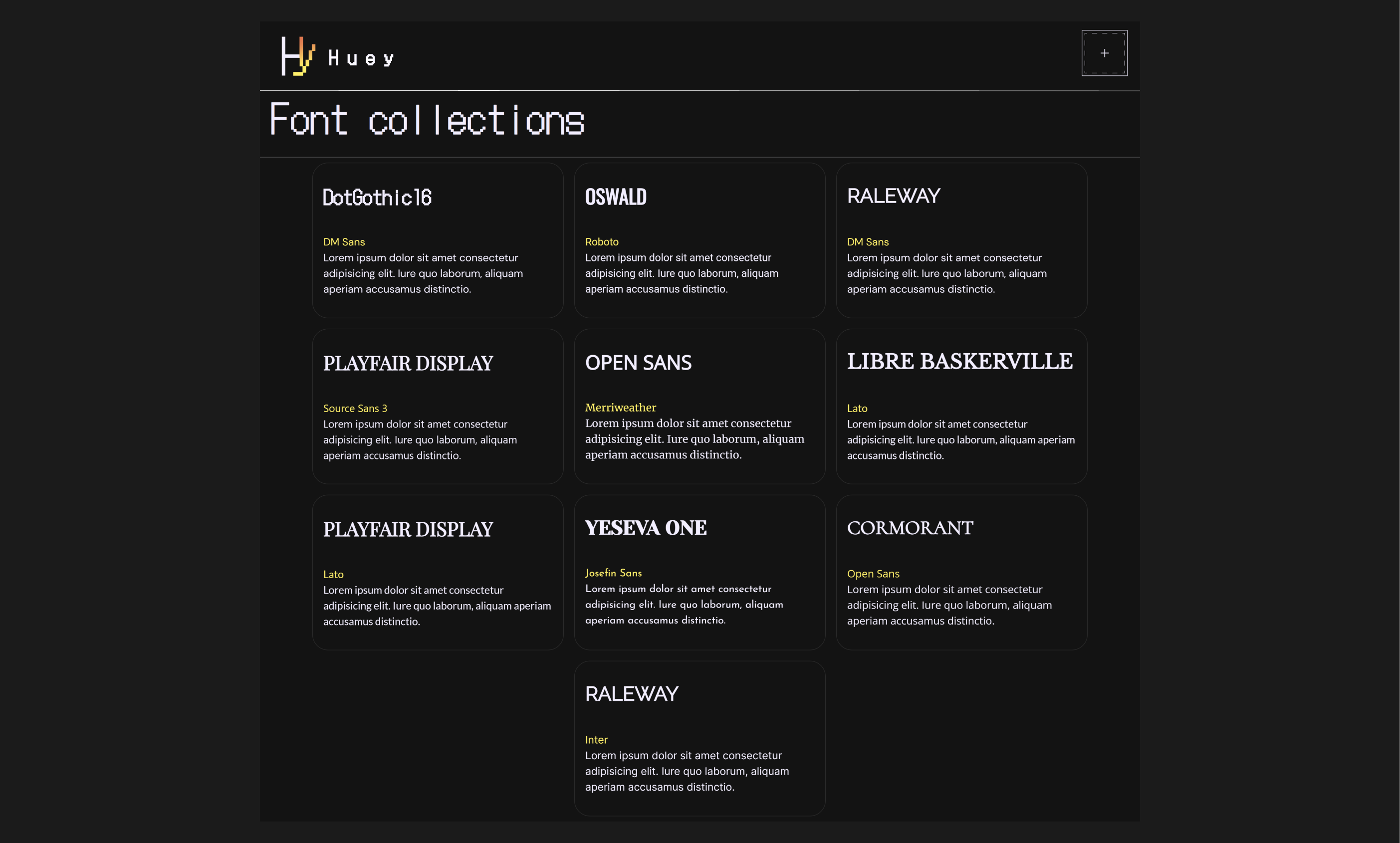
Picking fonts always feels like hunting through a haystack for a needle. Especially for this pixel-themed website, I wanted the perfect combination to capture that retro vibe. But as I searched, a different idea sparked: why not create a resource for others struggling with font pairings? This page would be a one-stop shop for my tried-and-true combinations, saving designers the frustration of endless searches. The design itself is straightforward: the fonts are showcased side-by-side, with clear names and easy access information. No more flipping through endless tabs - just a quick glance to find the perfect pixelated font pairing.
Authentication
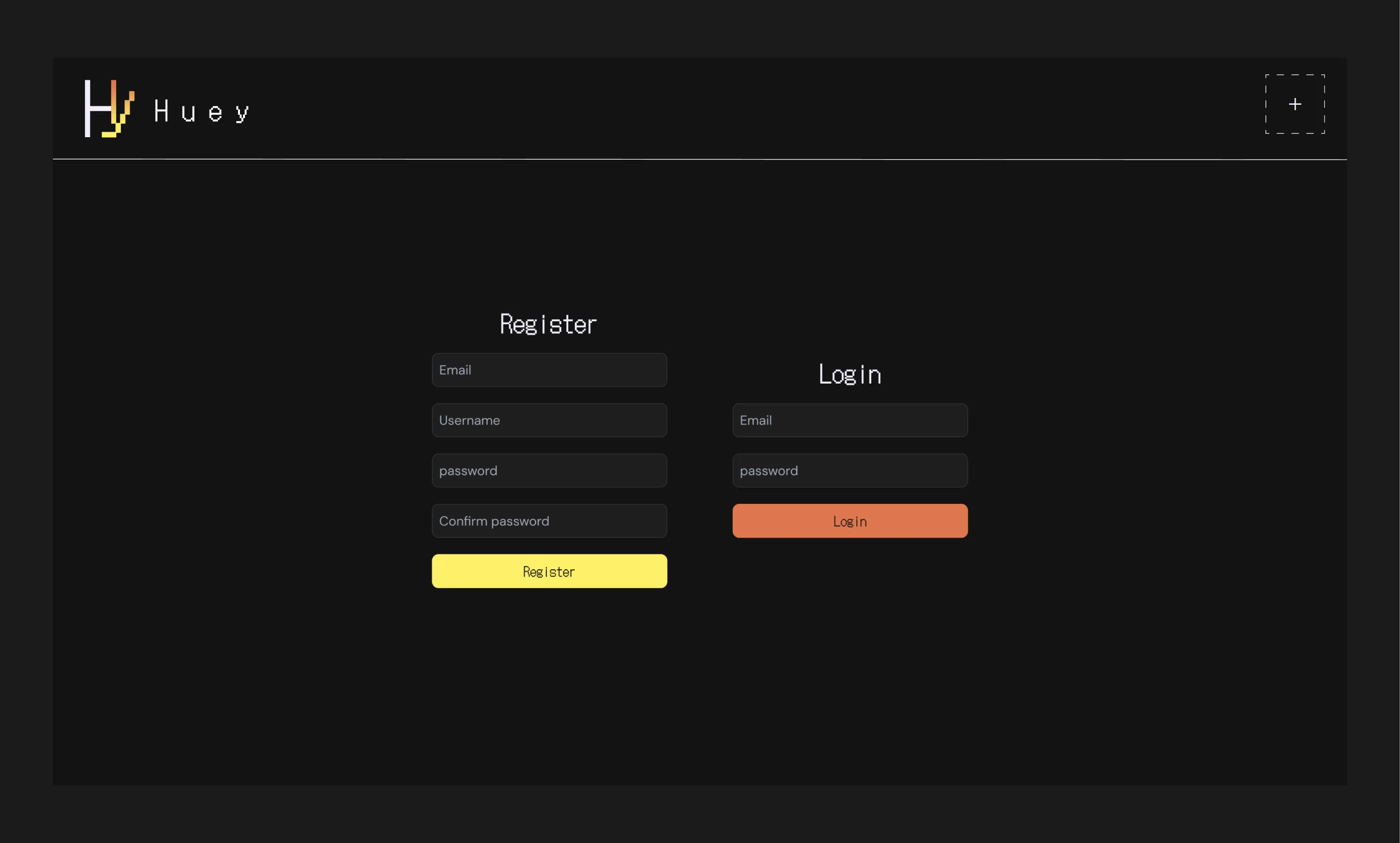
Designing the login page for my minimalist website turned out pretty easy, thanks to a website called Monkeytype. Here's the story: I looked at a bunch of login page designs online, but they were all cluttered and busy, which wasn't the vibe I wanted. Frustrated, I decided to take a break and do some typing practice on Monkeytype. Luckily, I was logged out, and when I saw their login page, it clicked! It was simple, clean, and exactly what I needed. Monkeytype's login page became my inspiration, showing me how to create a user-friendly login page that matched my website's minimalist style.
About Us
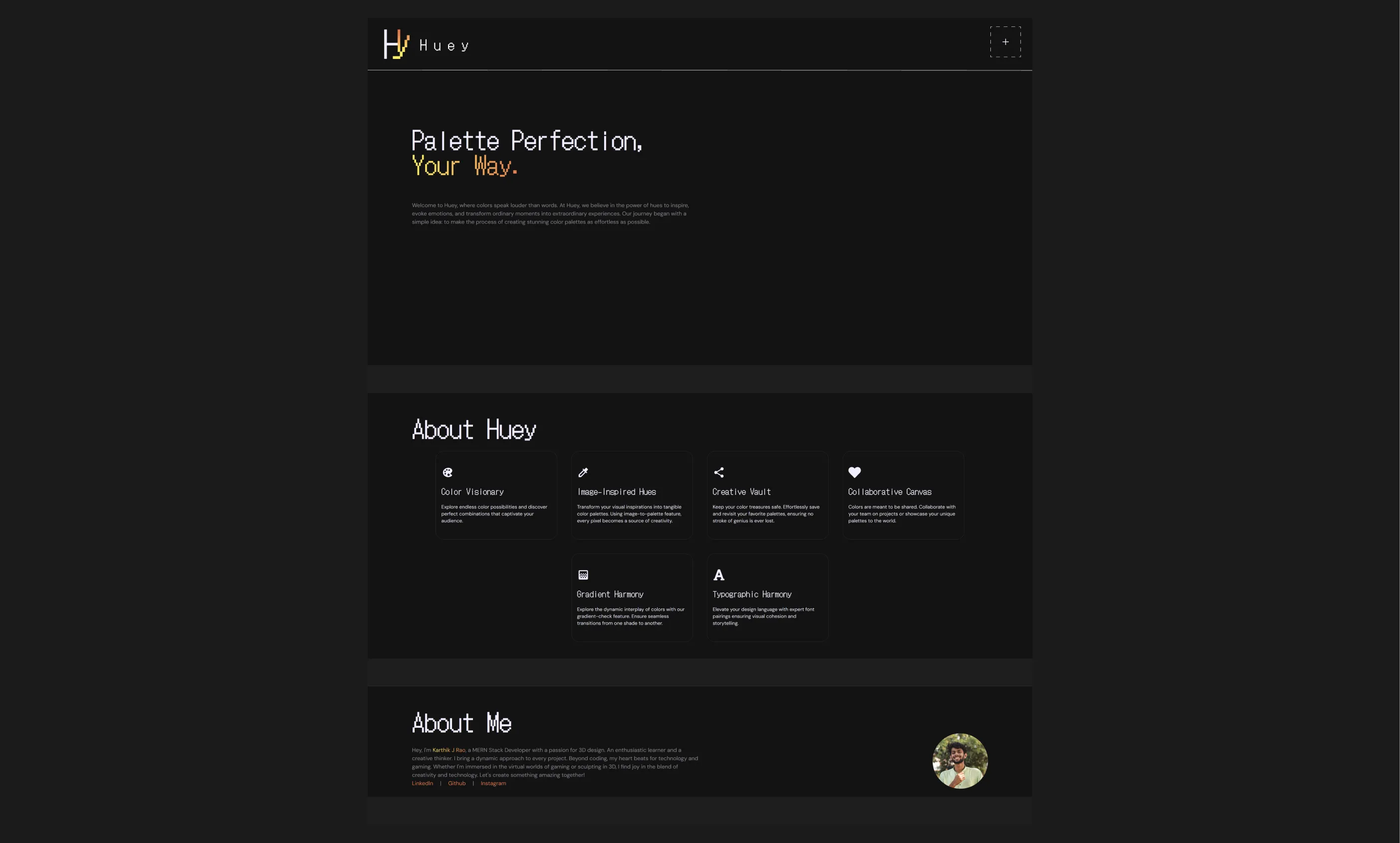
The "About Us" page was a tricky one - I wanted it minimal yet informative. So, I divided it into three parts: a short website intro, explanations of the features, and a simple bio about me (the creator!). Drawing inspiration from a website with a four-word description and a concise paragraph, I incorporated that clean approach for the intro. The biggest hurdle was showcasing features in an engaging way. Then, it dawned on me - cards! Inspired by the font pairing cards I created :P, I realized this format would be perfect to display the features in a visually appealing way, and that's how the "About Us" page design came to life!